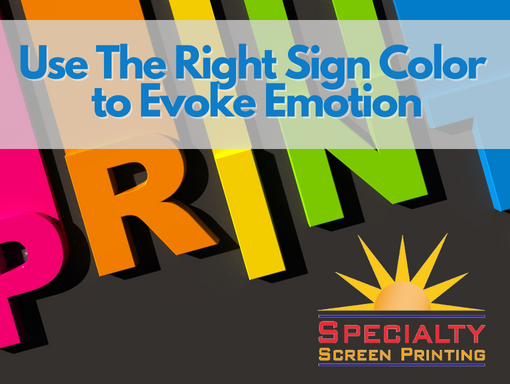
When you’re having signage printed, you want to get the most bang for your buck, which means getting attention and getting results. Choosing the right sign color is one of the best ways to do both.
On a sign, a website or a business card, colors have meaning. Need proof? Think about how color conveys meaning in the English language.
If you’re seeing red, you’re angry. You’re green with envy. When you’ve got the blues, you’re sad. If somebody calls you yellow, you might be a coward.
Most of those examples are just figures of speech, but there is real psychological research into the effects colors have on our emotions. In addition to conveying a message, you should want your sign or window cling to evoke an emotion.
The Psychology of Color
That’s where color comes in. Here are some examples of colors and the emotions they spark:
- Red: This color comes closest to matching the figure of speech above. Red evokes excitement, passion and even anger. When you see red you pay attention. Light reds and pink are usually colors of friendship, love and femininity. Dark reds can signify leadership and action.
- Yellow: Yellow makes people feel happy and optimistic. Think sunshine and warmth. It can also signal affordability.
- Blue: Have you ever noticed how many banks and financial companies use blue in their branding? That’s because blue means authority, trust and security. If you’re going for a sense of peace and tranquility, light blue works.
- Orange: Orange evokes playfulness, energy, creativity and freedom.
- Green: Nature and health are the overarching images conveyed by green. Various shades of green can also create a sense of stability and prosperity.
- Black: Feelings and images created by black include sophistication, elegance, secrecy, luxury … and evil.
When it comes to designing a sign, though, one color isn’t enough. Even if you choose a white background for your green letters, that’s two colors. Designers often recommend choosing complementary colors from a color wheel.
Opposites Complement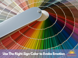
For example, each of the primary colors – red, blue and yellow – each has a complementary color on the opposite side of the color wheel. Red and green are complementary colors, as are blue and orange, and yellow and purple.
Unless you’re designing a sign for Christmas, you might want to avoid red and green together. Also, stay away from using complementary colors of the same brightness and intensity. Bright blue on a pastel orange background looks good, as does purple on light yellow.
Of course, the colors of your sign won’t matter much if people can’t read the sign from a reasonable distance. That means either dark text on a light background or light text on a dark background.
If your sign has a clear background – a window cling, for example – look to use white or light-colored letters and images. Even if a window is not tinted, the eye sees a window as a dark background.
The Right Emotion Can Lead to Sales
When you’re designing your next sign or printing project, remember that you need to design both in words and the language of color. Using the right colors can evoke responses that get your message across and generate more sales.
If you’re unsure about how to combine colors for the most impact, just ask Ken. He’s an expert in color design for screen-printed signs, labels and other items.
Specialty Screen Printing, a family-operated business, provides custom screen printing of all types and on all shapes of objects. We can print on glass, metal, wood, plastics, pressure-sensitive films, polycarbonate, and polyester. If you have an unusual shape to print on, a design that requires durable inks, or a problematic surface, give us a call. We love to help solve printing challenges!
Message us at info@specialtyscreenprinting.com, and let’s brainstorm about your next project.